


|
There are so many web-building tools out there now that it’s not massively difficult for a layperson to build their own attractive and well-designed website. However, knowing what ‘well-designed' actually means can be tricky. Even if you have hired someone else to build your website, it’s really useful to have an understanding of the basic foundations of a good website. A good website should look good and be easy and intuitive to use. It should build trust with your audience, and crucially, drive your visitors to take action. In this article, I outline 4 factors that are crucial for a high-performing and engaging website.
Know your ObjectiveAt every stage of your marketing strategy, you should think about your objectives. This can sometimes sound intimidating - but it needn’t be. Think about why your website exists and ultimately, what you want it to do for you. Here are some examples:
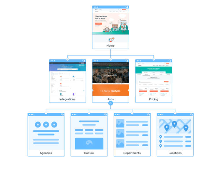
Every feature on your website should drive the user to fulfil that objective. There shouldn’t be distractions or mixed messages. For example, if your goal is to get your visitors to purchase, your product pages should not contain links to take the customer elsewhere on the website. Chances are that if they follow a link, they will not return to purchase. NavigationThere’s a saying that goes: “User experience is like a joke. If you have to explain it, it doesn’t work”. This is so true. Your navigation is a huge part of your user experience and your visitors should be able to float around your website with ease and without guidance. If they can’t easily find what they want, they’ll leave. Keep the structure simple and shallow like this:
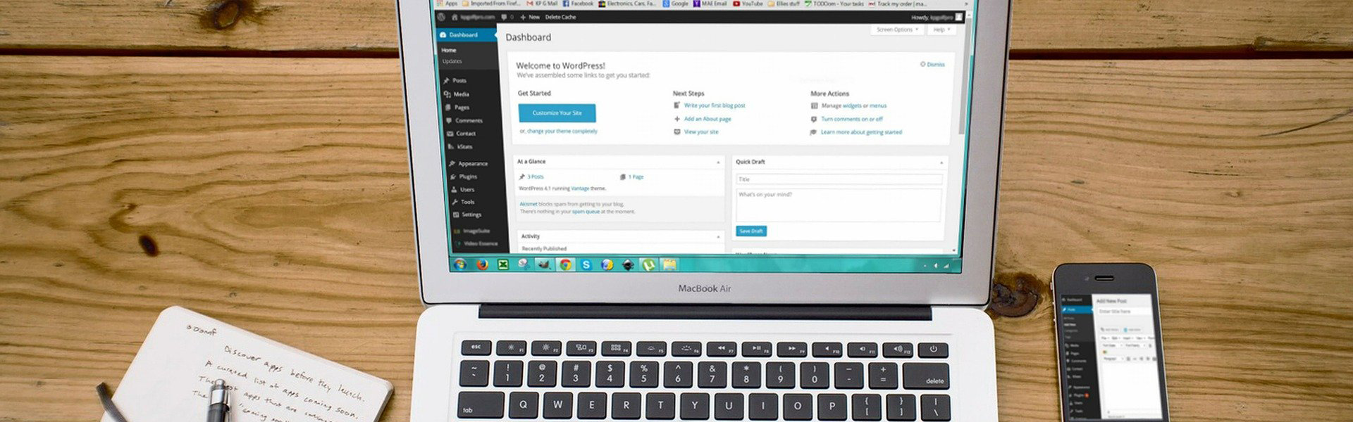
Image source: Hubspot AestheticsYou might expect that this goes without saying. However, I see a lot of websites that just look awful. And if your website doesn’t look good, why should I think that your products are any good? Having an attractive, cleanly designed website not only makes your products more appealing but makes your business seem more trustworthy. The following aspects make up an aesthetically pleasing website: Grid Design Most modern templates are in a grid design, using columns and rows for your content. These are the best to use. A grid layout makes your website simple, uncluttered and clean-looking. Make sure that your text and images align – if you have a row of images that are all in different sizes, the page won’t look quite right. Colour Keep your colour selection limited to less than 5 colours and make sure these colours work well together. Pinterest has a vast number of colour palettes that you can look at for inspiration. Colour is more important than you might think, as it can evoke strong emotional responses. Type It is important that typefaces are legible to everyone, including your Nan. Calligraphy fonts were very ‘in’ for a few years but are less popular now. Some of them are not overly easy to read. It’s good practice to get a few people to check out the text on your website to ensure that everyone can read the font. Make sure that you use a maximum of 3 different fonts on your website, otherwise, a page can look messy. Your typeface plays an important role. Think about your brand and how your typefaces can represent that. For example, you might use a strong, bold typeface for a young, ‘in-your-face’ clothing range, or a more classic one for ethereal jewellery or accessories. Imagery It is always worth investing in professional photography. Your images sell your products and they also sell your business. Images taken on your iPhone will not sell your product. As well as product images, you should use ‘lifestyle’ images. These are aspirational images that display your product in a way that will appeal to your target audience. For example, you might show a woman wearing your jewellery, posing in an exotic-looking place. These types of images, which fire the imagination, are proven to aid sales. Make sure your imagery fits in with your brand. It is always useful to write down 5 things that you would like people to feel after buying your product. For example, a person wearing your jewellery may feel empowered, attractive, unique, free and happy. Your imagery across your website - and all of your marketing channels - should attempt to invoke those emotions. Technical Stuff Make sure your website is fast to load. If your website takes more than 2 seconds to fire up, many of your visitors will give up and go somewhere else. If you are building on a Wordpress template, choose a template that is optimised for speed. Some can be very slow. Be sure to test your speed at each stage of the building process. Uptrends is a handy free tool to test the speed at which your website loads. Make sure your website works well on a mobile device. Many people (particularly people of my generation!) still struggle to understand that 70% or more of their website traffic will be on a mobile device. It’s likely that your template for Shopify, WordPress, Wix, etc. has been optimised for mobile devices. However, don’t take it for granted that your website will perform perfectly on a mobile. Again, you need to test this at each stage of the building process. Technical details, such as these, are not only important for the user experience. They are also an important part of your SEO. Google places a higher value on websites that are fast, easy to navigate and mobile-friendly. Therefore, your site has a better chance of ranking more highly in Google search. Go do it! As with most tasks in your marketing strategy, building a good website requires planning. Start with your objective and plan around that. Good luck! Wanting more after this blog? Why not sign up for one of our FREE 1-1 business or marketing consultations with Tiny Box Clinic?
|