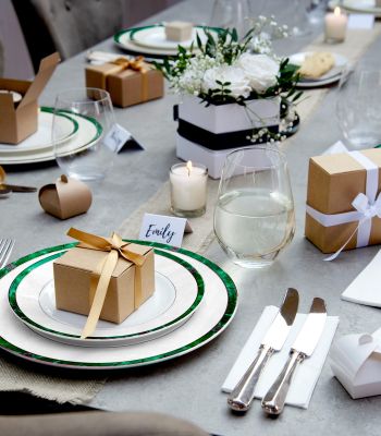


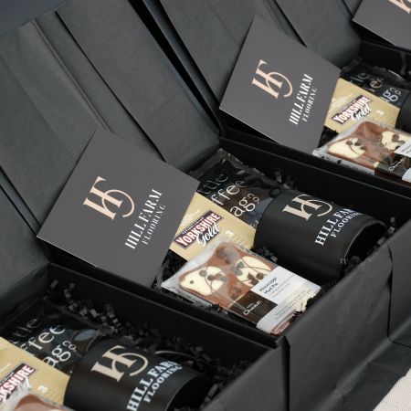
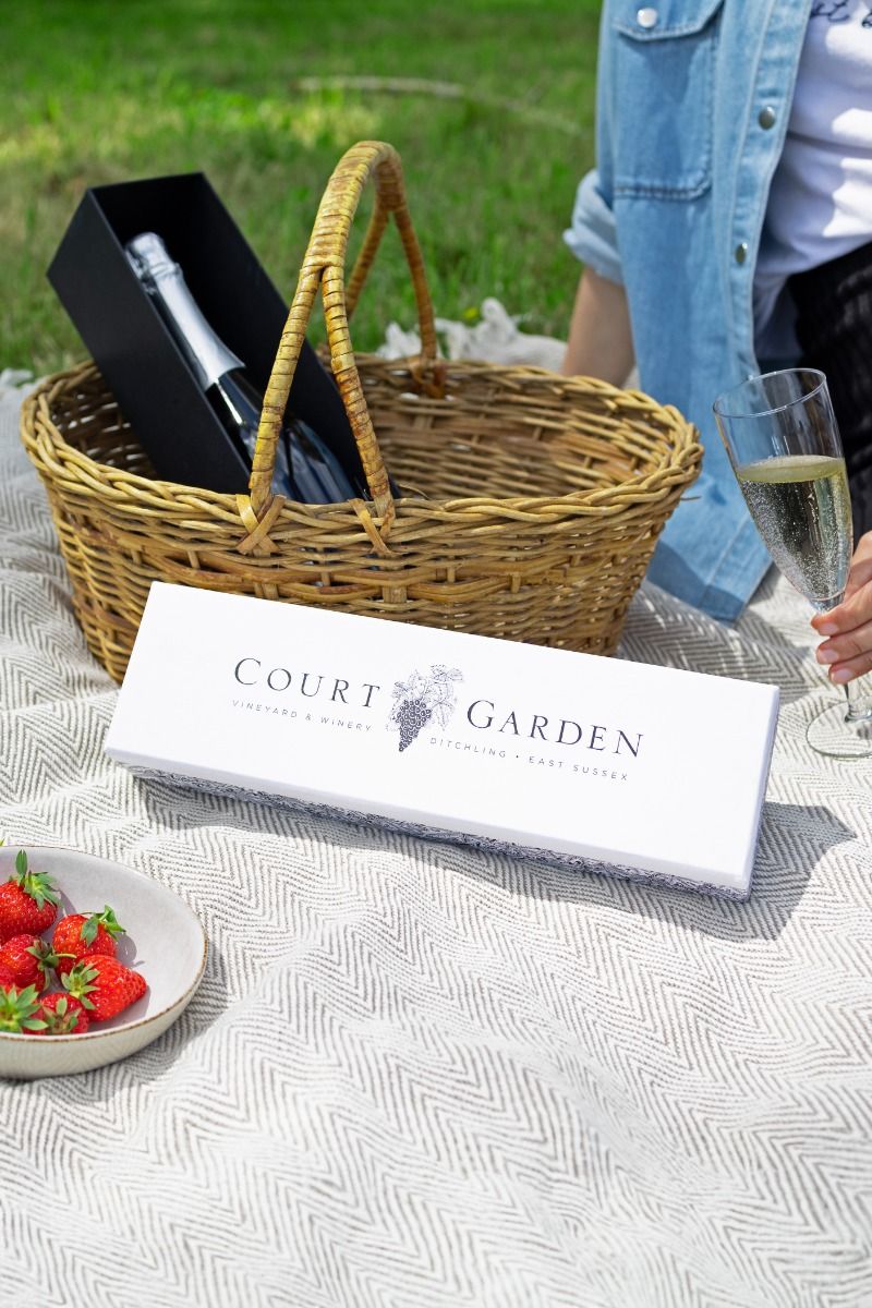
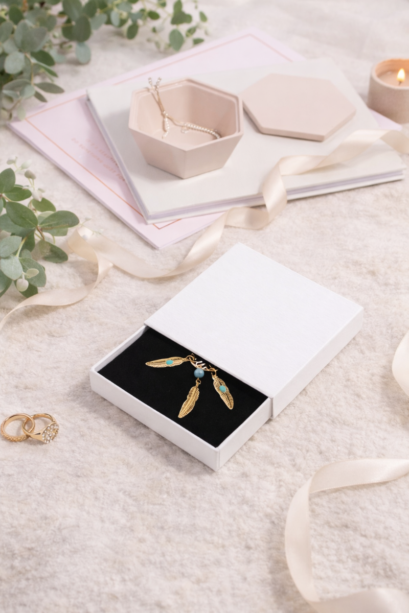
Branded Gift Boxes that Stay True to Your Colours
Colour-true branded gift boxes come from a clear palette brief, the right print method such as Pantone vs CMYK, and a proofing chain that includes on-stock drawdowns and a signed golden sample. Control stock, finish, lighting and tolerances. Document every approval so reprints match without costly do-overs.
If you’re ready to explore more branding options, check out our Branding Hub.
Why Branded Box Colours Change, Even with the Same Artwork
If your branded gift box looks different between batches, it is rarely the artwork alone. Colour is affected by material, finish and process.
Stock, coating, ink and lighting effects:
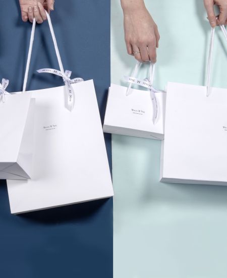
- Stock: Uncoated and kraft boards absorb more ink. Colours appear duller or warmer than on coated white. Recycled fibres can vary slightly between batches.
- Finishes: Matt and soft touch finishes lower contrast and can make dark colours look greyer. Gloss increases saturation. Foil is reflective metal, not printed colour.
- Ink systems and press type: Digital CMYK, litho spot inks and screen or foil printing all behave differently and have different colour ranges.
- Environment: Humidity, drying time and inspection lighting matter. Always review under D50 or D65 lighting, not mixed office LEDs.
The most common surprise shift scenarios:
- A CMYK build trying to match a vivid Pantone on kraft stock.
- Adding soft touch lamination late in the process and seeing colour mute.
- Switching suppliers without a golden sample and signed tolerances.
For more guidance on planning custom projects, see Custom Printed Gift Boxes on Realistic Lead Times.
Read: Custom Printed Lead Times
Pantone vs CMYK, What to Choose and Why
Choosing between Pantone vs CMYK packaging is one of the biggest decisions for branded corporate gift boxes.
When Pantone is worth it
Use Pantone spot inks when:
- Your brand colour is critical.
- You have solid logo blocks or corporate hues.
- You are printing one or two key colours.
Pantone inks are pre-mixed to a defined standard. This gives tighter colour matching but can increase cost due to extra plates and ink mixing.
When CMYK makes sense
Use CMYK when:
- Artwork includes photography or gradients.
- You have many colours in one design.
- Budget or lead time does not allow for extra plates.
Digital CMYK is fast for short runs of branded gift boxes UK wide, but not all Pantone colours can be matched exactly. Set realistic tolerances.
Digital vs litho outcomes:
- Digital CMYK: Faster for small runs. Smaller colour range.
- Litho with spot colours: Best for exact solids and larger volumes.
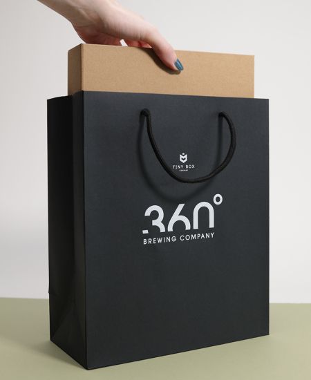
- Screen or foil: Ideal for rigid lids or bags where bold coverage or metallics matter.
The key is aligning expectation with method before you go to print.
Proofs and Drawdowns, What They Prove
A print proof for packaging is not just a tick box. Each proof type answers a different question.
Proof types
| Proof type | What it is | Good for | Limits |
|---|---|---|---|
| Digital proof | Colour-managed PDF or inkjet | Layout, type, rough colour | Not on your stock; finish not simulated |
| Press proof | Short run on production press | Final colour and registration | Takes time; not always possible |
| Ink drawdown | Ink rolled directly on your stock | Confirms colour vs Pantone on that material | Flat swatch only |
| Wet proof on blanks | Printed on uncut sheets | Final look with finish applied | Highest cost; use for key launches |
A drawdown proof for packaging is especially important for colour critical branded gift boxes. It shows how your actual ink behaves on your chosen board.
What to approve
Approve:
- Colour against Pantone or agreed CMYK build.
- Finish effect on tone.
- Legibility of small type and reverse out text.
- Rub resistance with a simple hand rub test.
Do not over-index on screen colour. Monitors vary. Always judge physical samples under neutral lighting.
Build a Colour Accurate Artwork Brief
Strong briefs reduce colour surprises.
Palette callouts, overprint and small type:
- List all brand colours with Pantone references plus CMYK, RGB and HEX values.
- If using CMYK, state the exact builds.
- Set total ink limit, often 280 to 300 percent, to avoid drying and scuffing issues.
- Define overprint and knockout rules. Avoid very small reverse text inside dense colour.
- Supply vector logos with outlined fonts and clear version naming, for example BrandGiftBox_Lid_V3_PMS7625C.pdf.
Finish notes and material selection:
- Specify board shade such as bright white, natural or kraft.
- Confirm finish: matt, gloss, soft touch or aqueous coating.
- If colour accuracy is critical on kraft, request a white under-print panel behind the logo area.
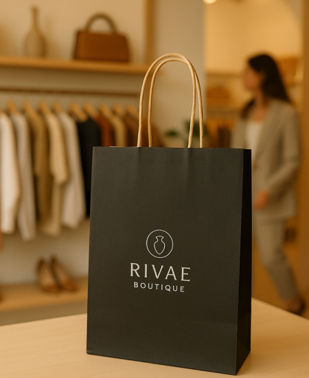
This is especially important for premium branded corporate gift boxes where colour consistency drives brand trust.
Your Repeatable Colour Approval Workflow
Colour consistency across print runs comes from process, not luck.
Lighting, sign-off roles and golden sample
- Kick-off: Share palette, tolerances, board and finish.
- Drawdowns: Approve ink on your chosen stock under D50 or D65 lighting.
- Pre-production proof: For critical runs, approve a press or wet proof with finish applied.
- Golden sample: Sign and date a fully finished sample. Mark it MASTER. Keep copies with your studio and supplier.
- Spec pack: Include photo under neutral light, colour notes and change log.
- Reprint control: Supplier must match master within agreed Delta E tolerance and record press settings.
Delta E, written as ΔE, measures colour difference. Lower numbers mean closer match. For example, ΔE 2 is a very tight tolerance for logos.
Change control across batches and suppliers
- Use a versioned spec with stated tolerances, for example ΔE 2 for logos and ΔE 4 for large CMYK areas.
- When moving to a new supplier, send the golden sample and spec pack.
- Always insist on on-stock drawdowns before full production.
This is how branded gift box colour stays consistent year after year.
Eco Friendly Choices Without Colour Disappointment
Recycled and kraft stocks
Expect warmer or slightly duller results on kraft or high recycled boards. Either embrace that tone or use white panels for key logo areas.
Finish choices for recyclability:
Choose aqueous coatings instead of plastic lamination where possible. If lamination is required, document how matt or gloss shifts the approved colour. Sustainability and colour accuracy can work together if planned early.
Golden Standards, Tolerances and Documentation
Golden sample pack contents:
- Signed master sample with date and project code.
- Photograph under D50 or D65 lighting with grey card.
- Palette sheet with Pantone references and CMYK builds.
- Delta E tolerances.
- Material and finish details.
- Press notes if available.
- Change log documenting revisions.
Supplier brief template
- Project: Branded gift box, [size], [finish]
- Colours: Pantone [list] or CMYK builds [list]. ΔE 2 for logos, ΔE 4 for large CMYK areas.
- Stock and finish: [board] with [finish].
- Proofs: On-stock drawdowns required. Press or wet proof if timeline allows.
- Deliverables: Golden sample for sign-off plus production samples per batch.
- Continuity: Match to master sample [code] on all reprints.
Explore more resources in our Branding Hub.
FAQs about colour control
Why do my branded gift boxes look different to my logo colours?
Stock, finish and print method all change perceived colour. Control them using drawdowns, proofs and a signed golden sample.
Is Pantone better than CMYK for packaging colour accuracy?
For solid brand colours, yes. Pantone spot inks are more consistent. For photography or short runs, CMYK is practical but requires clear tolerances.
What is a drawdown and do I need one for gift boxes?
A drawdown is your chosen ink rolled onto your actual stock. It confirms colour before artwork goes to press. We recommend it for colour critical branded gift boxes UK wide.
Which proof prevents surprises, digital or press?
Digital is good for layout and speed. Press or wet proof shows final colour and finish. Use both when the project is high value.
Why does colour change on kraft vs white stock?
Kraft has a natural tint that warms and darkens colours. Use white under-print panels if exact brand colour is required.
Do matt, soft touch or gloss finishes change colour?
Yes. Matt and soft touch mute. Gloss increases saturation. Always approve colour with the final finish applied.
How do I keep colour consistent across reprints and suppliers?
Maintain a golden sample pack, set Delta E tolerances, insist on on-stock drawdowns and log every approval.