

Why colours shift (and how to stop it)
If your logo looks perfect on one batch of printed gift bags and noticeably off on the next, you’re probably seeing the impact of Pantone vs CMYK differences, variations in paper stock, or finish effects like matt, soft-touch, and foil.
This guide walks you through simple, repeatable ways to lock down your brand colour consistency across suppliers, stocks, and seasons, so every run looks intentional, polished, and distinctly you.
Ready to brief your next run?
Pantone vs CMYK: the quick, non-jargony version
- Pantone (spot colour): A pre-mixed “recipe” ink, like ordering your exact shade straight from the chef. Ideal for logos and critical brand hues where you want predictable, solid coverage.
- CMYK (process colour): CYMK builds colours using Cyan, Magenta, Yellow, and Black dots on a press. It’s great for photos and gradients, but can be more temperamental when you’re chasing an exact logo match. Think of it as blending your own paint, rather than ordering the perfect shade off the shelf.
When to choose what:
- Solid brand colours or small runs of branded bags: Pantone spot ink wherever possible.
Photo-heavy designs or digital printing: Use CMYK, with careful CMYK colour matching to your brand references.
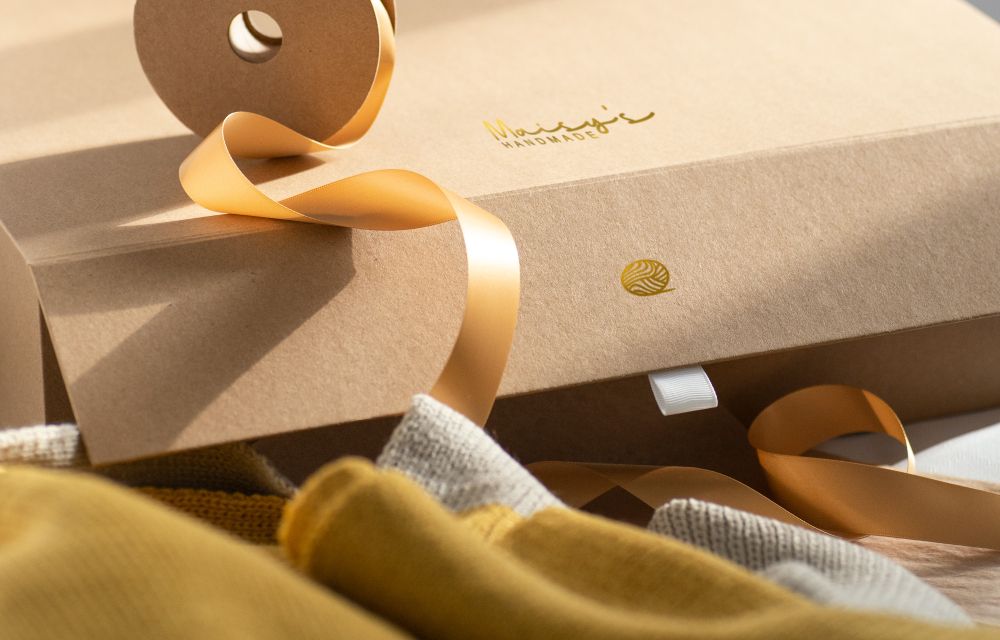
Coated vs uncoated: the biggest hidden culprit
One Pantone number, two very different looks. That’s why Pantone includes C (coated) and U (uncoated) versions.
- Coated (C): A smoother, sealed surface. Colours appear darker, richer, and slightly cooler.
- Uncoated (U): More absorbent, so colours appear lighter, softer, and can look warmer.
Rule of thumb: Always specify the correct Pantone suffix for your stock (for example, Pantone 200 C on a matt-laminated bag vs Pantone 200 U on an uncoated kraft tag).
If you’re printing CMYK on uncoated stock, expect a lift in ink coverage or a small tone tweak to compensate for absorption.
Pantone to CMYK conversion: what’s realistic
Some brand colours convert beautifully. Others sit outside the CMYK gamut (printable range) and will shift. Treat Pantone to CMYK conversion as “best achievable match”, not identical.
Practical tips for fewer surprises:
- Ask your supplier for CMYK build recommendations based on your Pantone and your chosen stock.
- Avoid converting bright neons or deep blues without a wet proof as they’re prone to drift.
- Supply vector logos with Pantone spot swatches included; we’ll create managed CMYK versions from that.
- or deep blacks on CMYK designs, use a rich black build (your supplier will advise) to avoid patchy or uneven coverage on large areas.
Finishes change perception (and recyclability)
Finishes alter how light hits the colour, so the same ink can look totally different after finishing.
- Matt laminate: Soft, lower contrast; colours look slightly flatter and darker.
- Gloss laminate: Higher contrast and more punch; looks crisp and cool-toned.
- Soft-touch: Velvet feel; beautiful to hold, but can knock back highlights, making colours feel more muted.
- Foil & emboss: Foil introduces metallic reflection; neighbouring colours can appear deeper or darker by contrast.
If colour accuracy is mission-critical, always approve the colour on the finished surface (see proofing ladder below). For eco-led projects, favour unlaminated or aqueous-coated papers, foil that can be removed, and keep mixed materials minimal.
Want more on finish aesthetics (not colour control)?
See our article on finishes that lift gift bags
The proofing ladder: from quickest to most certain
Choose the lowest rung that still protects your brand. Here’s how print proofs vs press pass options compare:
- Digital proof (screen PDF) - fastest, lowest cost
- Checks layout, spelling, and placement.
- Not reliable for colour.
- Digital hard proof (calibrated print) - quick, low cost
- Simulates CMYK colour on paper.
- Useful for CMYK-only jobs, but less useful for Pantone or specialty finishes.
- Pantone drawdown - high confidence for spot colours
- Your exact Pantone ink, rolled on your chosen stock.
- Ideal for comparing coated vs uncoated Pantone appearances, or approving any tweaks.
- If colour is critical, make sure you mention “Pantone drawdown” in your PO.
- Wet proof - press-made sample(s)
- Your inks, your stock, and (ideally) your intended finish.
- Recommended for tricky Pantone to CMYK conversion or designs with large solid areas.
- Press pass - on-press approval
- You attend the start of production to sign off colour live on press.
- Highest certainty, but plan extra time and budget. It’s a white glove moment, but worth it for important runs.
Simple choice guide:
- Launch event or VIP gifting? → Drawdown (Pantone) or Wet proof (CMYK).
- Reprint of a proven job? → Digital hard proof is often enough.
- New stock or finish? → Drawdown on that exact stock.
Tolerance: agreeing “how close is close enough”
You don’t need a lab to talk Delta E colour difference; think of it as a score for how noticeable a colour is, and agree the tolerance before printing:
- ΔE ≤ 2: critical brand marks and solids (most people can’t see the difference).
- ΔE 2-3: acceptable for most backgrounds and secondary shades.
- ΔE > 3: usually noticeable. Time to check paper, finish, and ink adjustments.
Viewing conditions matter: Check proofs under neutral light (D50 or daylight) against a grey background. Not under warm office bulbs…and definitely not under your desk lamp!
Artwork setup that protects colour
- Supply vector logos (AI, PDF, EPS) with named Pantone swatches.
- Include a simple brand colour table: Pantone refs (C and U), CMYK builds, and any approved Lab* targets if you use them.
- Outline or expand any placed text; embed linked assets.
- Avoid RGB values for print as they’ll auto-convert unpredictably.
- Confirm overprint and knockout rules for small text, and white logos on dark bags.
Budget & timeline: when to invest
- Short runs and tight deadlines: Use established CMYK builds or previously approved drawdowns. Request a digital hard proof for layout.
- Seasonal collections or new campaigns: Budget for at least one Pantone drawdown per new stock/finish, or a wet proof for complex conversions.
- Brand refresh or new supplier: Start with drawdowns, then hold them as your master references for future reprints.
SME colour brief template (copy, paste, adapt)
Project: Custom printed gift bags
Brand colours: Pantone 186 C / 186 U (primary red); Pantone Cool Grey 11 C / U (secondary)
If CMYK required: Red = C0 M95 Y85 K0 (target ΔE ≤ 2 vs 186 C on coated)
Stock(s): 200gsm coated art + matt laminate (bags), 300gsm uncoated (tag)
Finish: Soft-touch for VIP run; standard matt for general
Proofing: Pantone drawdown on both stocks; digital hard proof for CMYK variant
Viewing light: D50 or daylight
Sign-off authority: [Name / role / date]
Notes: White logo to knockout; no overprint
PLEASE NOTE: We only offer Pantone matching on bespoke or custom orders.