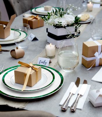


Who is this guide for
This is tailor-made for UK brand managers and gifting pros who want their logos to shine at a glance, whether on shelves, at events, or in photos. Expect clear, practical advice on logo placement, dielines you can actually use, and minimum sizes that work on printed gift bags of all shapes and sizes.
Ready to get your project rolling?
Readability at a glance (how people actually see bags)
People don’t get up close and personal with your bags right away, so:
- Retail shelf: ~1-2m
- Events and hand-outs: ~0.5-1m
Make sure your logo’s wordmark is easy to read at these distances…no squinting required.
The Top-Third Rule
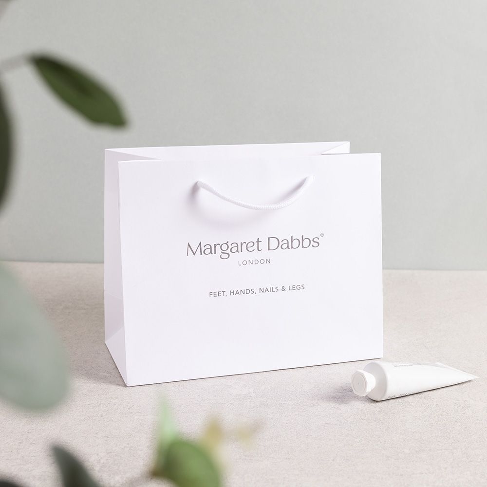
The best spot? The upper third of the bag front, just below the handle line. This sweet spot is where eyes naturally land. Centre your logo here for maximum impact.
Keep it simple:
One clear hero logo beats a clutter of smaller ones. If you want extras, put them on the back or the gusset (that side fold) instead.
Safe areas by bag type (handles, folds, gussets)
Packaging has its quirks; handles, folds, creases, and all. Every bag and printing type will have it's own restrictions, but here's a run down to keep your logo in view:
Front & back panels
- Top clearance: Keep logos at least 25 mm below the top fold or 15 mm below the handle eyelets (whichever is lower).
- Side clearance: Stay 12 mm away from left and right folds to avoid logo distortion.
- Bottom clearance: Leave 20 mm above the bottom fold to avoid scuffs or weird angles.
Gusset panels (side foldes)
Use these for repeat patterns or URLs, not the main logo. If you do place a logo here, keep it 10 mm away from folds and orient it vertically for easy reading.
Fold-over tops
If your bag has a fold-over top, make sure your main logo stays completely below the fold line. Don’t let it straddle the fold, it’s a recipe for confusion.
Die-cut windows or closures
Keep logos 8 mm clear of any die-cut windows, rivets, magnets, or ribbon pass-throughs. These can interrupt the logo and make it look like a puzzle piece!
Pro tip: Print a full-size mockup on the dieline template, fold it, thread a sample handle, and check real-world clearances before you sign off.
Start with a dieline (don't place on a flat mock)
Don’t place your logo on a flat, front-facing image alone; packaging folds and trims matter. Begin with the dieline (the flat layout showing folds and trims) in your vector software. This lets you see exactly where folds, edges, and bleeds will be.
Want the back panel to match? Mirror it and measure from the same reference points to keep it consistent.
Always leave clear space around your logo equal to at least half the logo’s height, no text or patterns crowding it.
Export an annotated PDF with dimensions and dieline layers for your supplier. Need a dieline template? Speak to your supplier and they might be able to help.
Minimum sizes & stroke weights (by print method)
These are your go-to starting points for logo size and line thickness to keep things crisp and legible.
| Print Method | Logo Width (Small / Medium / Large) | Stroke Weight |
|---|---|---|
| Litho (Offset) | 40–50 mm / 60–80 mm / 90–120 mm | 0.25–0.3 mm (0.75–1 pt) |
| Screen Print | 50–70 mm / 80–100 mm / 110–140 mm | 0.4–0.5 mm (1.2–1.5 pt) |
| Digital Print | 35–45 mm / 55–75 mm / 85–110 mm | 0.2–0.25 mm (0.6–0.75 pt) |
- For reverse-out text (white on dark), keep x-height at least 1.6 mm (~6 pt).
- Fine scripts or hairlines might need a size boost.
- Foil logos? Keep lines at least 0.3-0.4 mm thick and text clear at 6-8 pt. Pair with embossing for that extra pop on soft-touch or uncoated paper.
Remember: It’s usually logos that are too small, not too high, that cause legibility problems.
Contrast & backgrounds (knockout vs overprint)
Good contrast is king here, and is sometimes even more important than size.
- Knockout logos: White logos on dark bags look sharp and clean. Just make sure you leave enough clear space so edges don’t get lost in patterns.
- Overprint on colour: Use solid colour blocks or a small halo (2-3 mm) to separate logos from busy backgrounds.
- White ink: Great for dark or textured stocks, but test opacity first.
- Metallic foil: Highest contrast on dark bags, but watch tiny gaps in letters and keep them wider than 0.6 mm.
Need photography tips?
Check out our guide on photography that makes gift bags look true
Finishes & legibility (quick effects guide)
- Matt laminate: Cuts glare and softens edges, great for dense logos.
- Gloss laminate: Shiny, but avoid placing logos near handle glare at the top.
- Soft-touch: Luxurious feel, slightly darkens colours. Combine with foil or spot UV for crispness.
- Foil: Bright and eye-catching; avoid super thin lines, and keep pressure even across folds.
- Emboss/Deboss: Adds texture and definition; bold artwork works best on textured or uncoated papers.
For a deeper dive:
Single hero mark vs repeat pattern: what's right for you?
- Hero mark (centre-front): Best for brand recognition at a glance. Aim for the upper third and give it plenty of breathing room.
- Step-and-repeat (tile): Perfect for events or fashion vibes. Make sure one tile lands right in the centre front and isn’t sliced by handles.
- Back panel: Smaller logo or URL here, to keep hierarchy clear.
File prep & proofs (avoid production surprises)
- Use vector files (AI, PDF, EPS) with named spot colours.
- Embed fonts or outline text.
- Confirm knockout/overprint for whites and metallics.
- Use rich black builds for big dark panels.
- Always request a printed mockup or wet proof on your chosen stock and finish.
- Check handle hole alignment by threading real ribbon or rope through, then snapping a photo under store lighting for peace of mind.

Placement quick picks (by bag size)
| Bag Size | Logo Width (mm) | Placement Below Top Fold (mm) |
|---|---|---|
| Small (≤180 mm) | 60–80 | 30-40 |
| Medium (200-280) | 80-110 | 35-50 |
| Large (≥300) | 120-160 | 45-60 |
Start here and tweak based on your wordmark shape and handle hardware.
See our Pantone and CYMK guide.
Take a look at our range of gift bags, ideal for branding.