

Designing Artwork For Gift Boxes: Avoiding Glue Area Clashes
Avoiding glue area clashes in art is one of those packaging details that looks tiny on a dieline and enormous once the box is assembled. A logo disappearing into a fold, a product message stuck under a glue flap, or a hero graphic broken by a join can make premium packaging feel unexpectedly messy. For technology brands, where precision and polish are part of the promise, artwork needs to behave beautifully after assembly, not just on screen.
For VP-level technology brand leaders managing consumer products, event gifting, launch kits, and corporate packaging, artwork that prevents glue area overlaps is not just a design task. It is a brand control issue. The box has to protect sensitive products, support global logistics, meet sustainability expectations, and still deliver a clean, confident unboxing experience.
This guide explains how safe areas, glue paths, dielines, and panel overprints help keep graphic design packaging clean after production, so your brand lands exactly where it should: visible, polished, and unmistakably yours.
Explore gift box packaging that helps your brand look sharp from dieline to unboxing.
What Are Glue Area Clashes In Packaging Design?
Glue area clashes happen when artwork, logos, text, patterns, QR codes, or key design details overlap with the areas of packaging that need to be glued, folded, tucked, joined, or hidden during assembly.
In plain English, it is when beautiful artwork ends up exactly where the packaging needs to stick itself together.
This can cause:
- Logos being partly covered.
- Text disappearing into folds.
- Pattern breaks at joins.
- Visible glue marks on printed areas.
- Misaligned panels.
- QR codes or legal copy becoming unreadable.
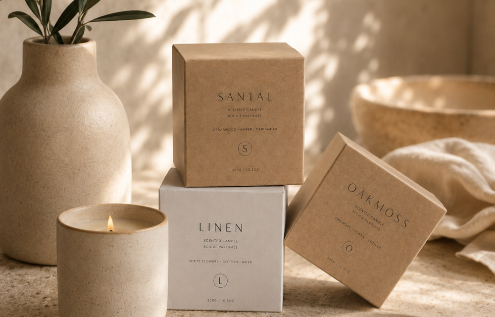
- A premium box looking less premium once assembled.
The solution is not less creativity. It is smarter artwork placement. Good brand and packaging design works with the structure, not against it.
Why Glue Areas Matter For Technology Brands
Technology packaging carries a lot of responsibility. It has to protect a product, explain its value, create anticipation, support retail or event display, and reassure the customer that what is inside is high quality.
For technology brands, glue area clashes can affect:
- Brand perception: A messy join or interrupted logo can make packaging feel less precise, which is not ideal when the product inside is positioned around innovation and quality.
- Unboxing experience: Premium packaging should feel controlled from the first look to the final reveal. Misplaced artwork can interrupt that experience.
- Operational efficiency: If artwork does not suit the dieline, production teams may need late-stage fixes, reproofing, or repacking, all of which add friction.
- Global consistency: For consumer products, launch kits, and corporate events across multiple markets, consistency matters. Every box should tell the same brand story.
- Sustainability goals: Avoiding artwork errors can reduce wasted samples, reprints, rejected packaging, and unnecessary material use.
Good packaging design is not just what the customer sees. It is everything that had to go right before they saw it.
Safe Areas: The First Line Of Defence
Safe areas are zones on a packaging dieline where important artwork should sit to avoid being cut, folded, glued, or hidden during production.
They help protect:
- Logos.
- Product names.
- Legal copy.
- QR codes.
- Icons.
- Instructional text.
- Campaign messages.
- Key visual elements.
For technology packaging, safe areas are especially important because boxes often carry technical information, product specifications, regulatory marks, serial details, and multi-language content. If any of that falls too close to a fold or glue path, readability can suffer.
A strong safe area strategy helps packaging look intentional after assembly. Not “nearly right”. Right.
| Artwork Area | What It Does | What To Keep There |
|---|---|---|
| Safe area | Keeps key artwork away from cuts, folds, glue flaps, and hidden joins. | Logos, product names, legal copy, QR codes, icons, and campaign messages. |
| Glue path | Shows where adhesive, overlap, or hidden assembly areas will sit. | Keep important artwork away from this area. Use low-detail backgrounds where needed. |
| Bleed area | Extends artwork beyond the cut line so printed edges finish cleanly. | Background colour, patterns, or image extensions, not key copy or logos. |
| Panel boundary | Shows where each flat panel will fold into the assembled box. | Use to plan branding, opening sequence, and panel overprints. |
Glue Paths: Know Where The Box Needs To Work
Glue paths are the areas where adhesive is applied to hold the packaging structure together. These areas need to stay practical, clean, and production-ready.
When artwork overlaps glue paths, several issues can appear:
- Adhesive may not bond properly.
- Ink or coating may affect glue performance.
- Printed detail may be hidden.
- Glue marks may show through.
- The join may look untidy.
- Assembly may become less reliable.
This is why packaging design agency teams, artworkers, production partners, and brand teams need to review glue paths before artwork is finalised.
A dieline is not just a template. It is the packaging’s choreography. Every panel, fold, cut, and glue point has a role. Nobody wants the logo dancing into the adhesive.
Dielines: The Map Behind The Magic
Dielines show the flat structure of a packaging item before it is cut, folded, glued, and assembled. They usually include cut lines, fold lines, bleed areas, safe areas, glue flaps, and panel boundaries.
For avoiding glue area clashes in art, dielines are essential because they show where artwork can safely sit and where it should not.
A good dieline review should ask:
- Where are the glue areas?
- Which panels will be visible after assembly?
- Which panels will be hidden or overlapped?
- Where are the folds and joins?
- Where does the customer first see the brand?
- Where will the box be opened?
- Which areas need legal, product, or event information?
- Does the artwork still make sense once folded?
For technology brands working across retail, e-commerce, and corporate events, the dieline should be checked against the full use case, not just the product shot.
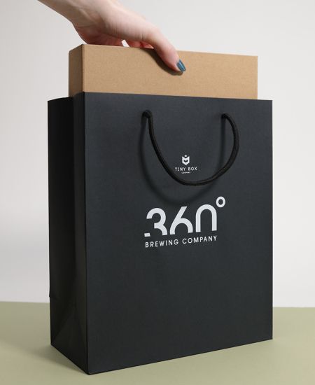
Panel Overprints: Keeping Visual Integrity After Assembly
Panel overprints are design techniques used to help graphics continue across folds, joins, or panels in a controlled way. They can support a cleaner finish when artwork wraps around a box or when colour needs to appear consistent across visible surfaces.
Panel overprints can help:
- Reduce visible breaks in patterns.
- Keep colour transitions smoother.
- Support full-wrap designs.
- Maintain graphic continuity.
- Improve the assembled look.
- Hide minor alignment tolerances.
- Support premium brand presentation.
They are particularly useful for cool packaging designs that rely on wraparound artwork, bold colour fields, technical patterns, gradients, or immersive brand storytelling.
For more on managing print across larger surfaces, read Full Wrap Print On Custom Boxes Without Banding.
The aim is not to pretend production tolerances do not exist. It is to design elegantly around them.
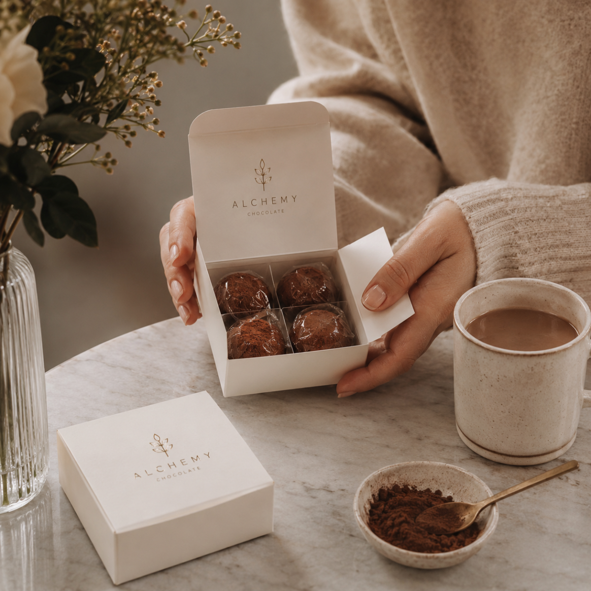
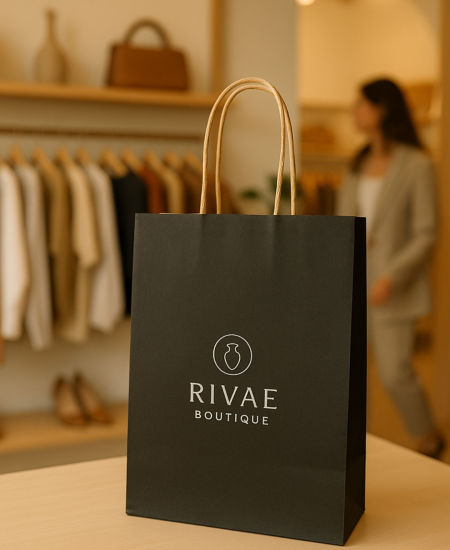
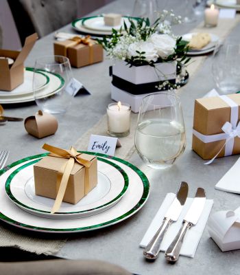
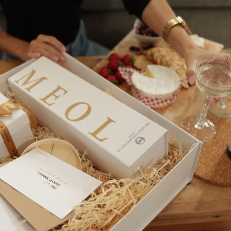
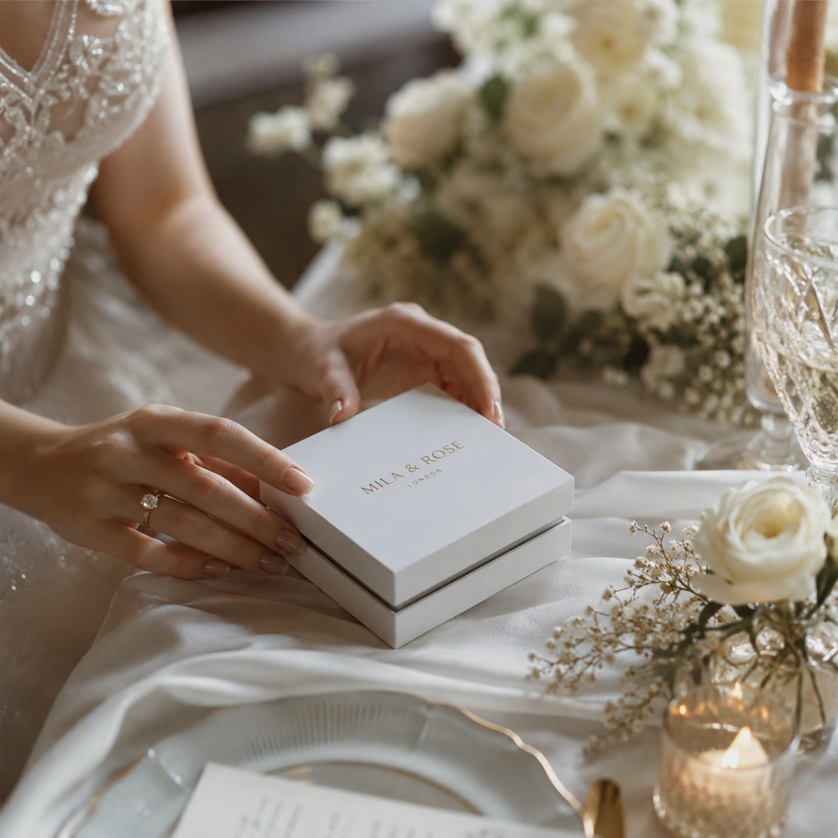
The Impact On Premium Unboxing Experiences
A premium unboxing experience depends on flow. The customer should move through the packaging in a way that feels deliberate: outer box, opening point, reveal, product, inserts, accessories, and any follow-up content.
Glue area clashes can disrupt that flow by making the packaging feel less refined. A visible join through a hero image, a hidden tagline, or a misaligned campaign graphic can pull attention away from the product.
Thoughtful artwork placement supports:
- A cleaner first impression.
- Better reveal sequencing.
- Stronger brand storytelling.
- More confident product presentation.
- Higher perceived product value.
- Stronger customer engagement.
- Better shareability across social and event channels.
For technology brands, the packaging should feel as considered as the product interface. Different medium, same expectation: clean, intuitive, and beautifully engineered.
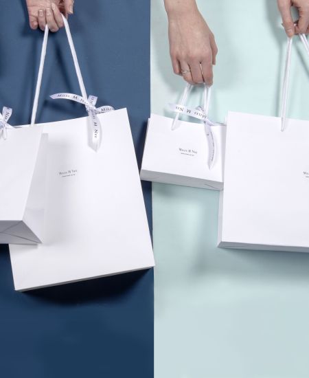
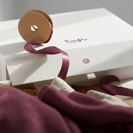
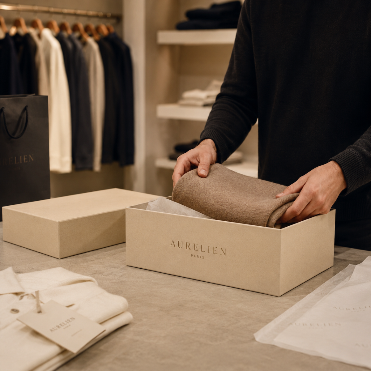
Dual Packaging Strategies: Consumer Products And Corporate Events
Many technology brands need packaging that works across two worlds: consumer retail and corporate events. Each has different pressures.
Consumer Product Packaging
Consumer packaging often needs to support retail display, e-commerce delivery, protection, product education, compliance information, and premium unboxing.
Artwork must be clear, structured, and production-safe. Glue areas should never interfere with product claims, regulatory marks, serial information, or customer-facing copy.
Corporate Event Packaging
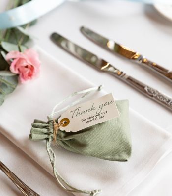
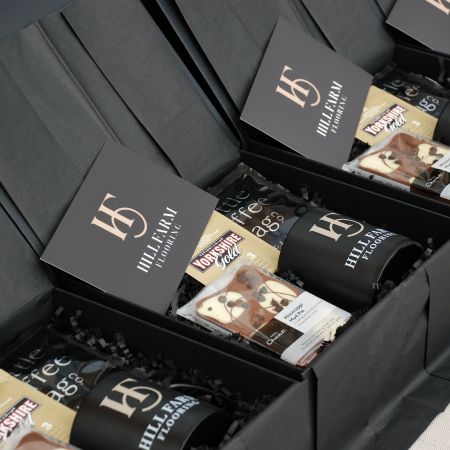
Corporate event packaging may include launch kits, press packs, investor gifts, employee onboarding, conference merchandise, or VIP product previews.
These packs often need more storytelling, more personalisation, and more visual impact. That makes glue area control even more important because campaign artwork is usually doing more of the emotional heavy lifting.
One Brand, Different Packaging Jobs
A dual packaging strategy should keep core brand assets consistent while adapting layout and artwork placement to the structure. The logo, colour system, tone, and visual hierarchy should remain recognisable, even when the pack format changes.
That is where creative solutions for artwork placement come in: not forcing one design onto every box, but translating the brand cleanly across formats.
How Packaging Design Supports Brand Perception
Packaging design has a direct impact on how customers judge quality. Before they turn on the device, open the accessory, scan the code, or experience the software, they experience the box.
Clean artwork tells customers:
- The brand is detail-focused.
- The product is premium.
- The experience has been designed carefully.
- The company values presentation.
- The packaging is part of the product story.
Messy artwork tells a different story, even if the product inside is excellent.
For a technology brand, this matters because packaging is part of the customer engagement model. It can support excitement, reassurance, confidence, and loyalty. If your product is designed to increase customer connection, the packaging should start that relationship with precision.
Sustainability And Glue Area Planning
Sustainability in packaging is not only about material choice. It is also about reducing avoidable waste, improving production accuracy, and designing packaging that performs without unnecessary rework.
Thoughtful glue area planning can support sustainability by helping reduce:
- Failed samples.
- Rejected print runs.
- Reworked artwork.
- Over-engineered packaging.
- Additional labels used to cover mistakes.
- Material waste from misaligned production.
- Extra components used to compensate for poor design.
For sustainable UK packaging strategies, claims should still be specific. Use language such as recyclable board, recycled content with a stated percentage, FSC-certified options, or plastic-free where the full construction supports it.
If your business maps packaging decisions to SDGs goals or CSR reporting, cleaner artwork processes can contribute to waste reduction and stronger documentation. It is not the whole sustainability story, but it is a smart chapter.
Operational Efficiency: Why Design Decisions Affect Production
A packaging concept can look outstanding in a presentation deck and still create problems in production if glue paths, folds, safe areas, and assembly steps have not been considered.
Operational efficiency depends on artwork that works with:
- Production tolerances.
- Assembly order.
- Glue application.
- Folding direction.
- Material behaviour.
- Packing speed.
- Quality checks.
- Transport and storage.
- Global supply chain requirements.
For high-volume product packaging or event rollouts, small artwork issues can become expensive at scale. A 2mm clash on one sample may seem minor. On 50,000 boxes, it becomes a very well-travelled mistake.
A good design packaging group or packaging partner should flag these issues early, before the artwork reaches final approval.
| Risk Area | Possible Issue | Why It Matters |
|---|---|---|
| Branding | Logo, tagline, or hero artwork is hidden by a fold, join, or glue flap. | Can make premium packaging feel less precise and less considered. |
| Production | Ink, coating, or artwork placement interferes with glue performance. | May cause assembly issues, rework, rejected samples, or delayed approval. |
| Compliance | Legal copy, QR codes, or product information sits too close to folds or hidden panels. | Can reduce readability and create extra proofing pressure. |
| Customer experience | The opening sequence feels messy or visually interrupted. | Can weaken unboxing, perceived quality, and brand confidence. |
Best Practices For Avoiding Glue Area Clashes
Use these best practices when designing artwork that prevents glue area overlaps.
1. Start With The Correct Dieline
Always design from the approved dieline for the exact box style and size. Do not adapt artwork from a similar structure and hope the glue areas match. Hope is not a production method.
2. Mark Glue Areas Clearly
Glue paths should be visible in the artwork file as non-printing guides. Everyone reviewing the file should understand where adhesive, overlap, and hidden areas sit.
3. Keep Key Artwork In Safe Areas
Place logos, text, QR codes, icons, and product messages away from folds, cuts, glue flaps, and panel overlaps.
4. Check The Assembled View
Review the flat artwork and a 3D mock-up. Some problems only appear when the box is folded into shape.
5. Use Panel Overprints Thoughtfully
For wraparound designs, extend colours or patterns carefully across panels so small production shifts do not create obvious visual breaks.
6. Avoid Fine Detail Near Joins
Tiny text, delicate lines, QR codes, and precise patterns should not sit close to glued edges or folds.
7. Test With Real Samples
Digital mock-ups are useful, but physical samples show how the material, glue, folds, and artwork actually behave.
8. Align Design And Production Teams Early
Brand, artwork, production, procurement, and fulfilment teams should review packaging before final sign-off. Everyone sees different risks.
Creative Solutions For Artwork Placement
Avoiding glue areas does not mean compromising the design. It often creates better design because it forces clearer hierarchy and smarter use of space.
Creative options include:
- Move key branding to primary panels: Keep hero branding on the front, lid, or main reveal panel rather than near joins.
- Use pattern in glue-risk areas: Abstract textures, gradients, or low-detail backgrounds can tolerate overlaps better than text or logos.
- Create intentional wrap moments: If artwork wraps around a corner, design the transition so it feels deliberate.
- Use inserts for detailed information: If the outer box is structurally busy, move technical copy, onboarding steps, or campaign messages onto inserts.
- Use sleeves or belly bands: A sleeve can carry campaign artwork without interfering with the box’s glue construction.
- Design the reveal panel separately: For unboxing-led technology products, the inside lid or first reveal panel may be the best place for brand storytelling.
This is where premium packaging gets interesting: fewer clashes, more theatre.
Common Misconceptions About Glue Area Clashes
“The Printer Will Fix It.”
Production partners can flag risks, but they cannot always redesign artwork without affecting brand approval, timing, or cost. Build the artwork correctly from the start.
“It Looks Fine On The Flat Proof.”
Flat proofs are only part of the story. Boxes are folded, glued, pressed, packed, and opened. Always review the assembled version.
“A Small Overlap Will Not Matter.”
Sometimes it will not. Sometimes it will cover the first letter of your brand name. Test before assuming.
“Glue Areas Are Only A Production Issue.”
Glue areas affect brand visibility, unboxing, sustainability, customer experience, and operational efficiency. They are a strategic design detail.
“More Artwork Means More Premium.”
Not always. Premium design often comes from restraint, hierarchy, and detail control. Give the artwork room to breathe and the glue room to do its job.
Packaging For Merchandising And Events
Merchandising packaging often needs to work harder than standard product packaging. It may be displayed at events, handed to press, photographed by influencers, opened on camera, or reused internally.
That means artwork must be robust across more touchpoints.
For event and merchandising packaging, check:
- Will the logo be visible in photos?
- Does the box look clean from multiple angles?
- Are campaign messages away from glue areas?
- Does the opening reveal support the event story?
- Can packs be assembled quickly on tight timelines?
- Will the artwork survive courier and event handling?
- Are inserts needed for products, chargers, cards, or accessories?
- Can the design scale across different box sizes?
A client engagement strategy can start with a beautifully printed box. It can also stumble with a badly placed glue flap. Tiny hinge, big drama.
How To Review Artwork Before Approval
Before approving packaging artwork, run a structured review.
Artwork Review Checklist
- Is the correct dieline being used?
- Are glue areas clearly marked as non-printing guides?
- Are logos fully inside safe areas?
- Is key copy away from folds and overlaps?
- Are QR codes clear, flat, and scannable?
- Are legal and compliance details readable after assembly?
- Does the artwork still work in 3D?
- Are panel overprints used where helpful?
- Are colour transitions aligned across visible panels?
- Is the opening sequence visually clear?
- Has a physical sample been reviewed?
- Have sustainability claims been checked and supported?
- Has fulfilment reviewed the packed format?
- Is the design scalable across related packaging formats?
If the answer is “not sure” to any of these, pause before production. A small check now can save a very large sigh later.
How Glue Area Planning Improves Customer Engagement
Customer engagement is shaped by detail. A customer may not consciously notice that your artwork avoided every glue path, but they will notice that the packaging feels clean, coherent, and premium.
Glue-aware artwork can help:
- Increase customer confidence.
- Improve unboxing satisfaction.
- Support repeat purchase.
- Encourage social sharing.
- Strengthen perceived product value.
- Make product launches feel more polished.
- Reinforce brand memory.
This is especially important for technology brands, where packaging often introduces the product ecosystem. The box can guide setup, reveal accessories, explain value, and frame the product as part of a larger experience.
Good packaging does not just contain the product. It starts the relationship.
Working With A Packaging Design Agency Or Supplier
Whether you work with an internal team, a packaging design agency, a graphic design packaging specialist, or a production supplier, the workflow should make glue areas visible early.
Ask your partner:
- Can they provide approved dielines before artwork begins?
- Are glue paths and safe areas clearly marked?
- Can they create 3D mock-ups?
- Can they produce physical samples?
- Do they review artwork for production clashes?
- Can they advise on materials and sustainability claims?
- Can they support consumer and event packaging formats?
- Can they meet sampling and production deadlines?
- Can they scale across markets or campaign sizes?
The right partner will not simply say “send us the artwork”. They will help make sure the artwork survives the box.
Ready To Keep Your Branding Clean After Assembly?
Ready to design packaging that looks as sharp assembled as it does on screen? Explore gift box packaging and create premium boxes that protect the product, elevate the unboxing, and keep every brand detail exactly where it belongs.
FAQs
What Are Glue Area Clashes In Packaging Design?
Glue area clashes happen when artwork, text, logos, or key graphics overlap with areas that need to be glued, folded, joined, or hidden during assembly. This can cause branding to be covered, distorted, misaligned, or weakened visually once the box is produced.
How Can Safe Areas And Glue Paths Improve Packaging Aesthetics?
Safe areas keep important artwork away from cuts, folds, and glue sections. Glue paths show where adhesive and overlaps will sit, helping designers avoid placing key brand details where they may be hidden or disrupted.
What Is The Importance Of Panel Overprints In Packaging?
Panel overprints help maintain visual continuity across folded or joined packaging panels. They are especially useful for wraparound artwork, colour fields, patterns, and premium designs where small alignment shifts could otherwise become obvious.
How Do Dual Packaging Strategies Affect Consumer Products And Corporate Events?
Consumer packaging usually needs to balance retail display, product protection, compliance, and unboxing. Corporate event packaging often carries more storytelling and campaign detail. Both need brand consistency, but artwork placement should be adapted to each format and use case.
What Role Does Thoughtful Design Play In Enhancing Unboxing Experiences?
Thoughtful design controls the order in which customers see branding, product information, inserts, and the product itself. When artwork avoids glue areas and supports the box structure, the unboxing feels cleaner, smoother, and more premium.
How Can Packaging Design Support Sustainability Goals?
Good packaging design can reduce wasted samples, rejected print runs, unnecessary rework, and extra materials used to cover mistakes. Sustainability claims should still be specific, supported, and linked to materials or certifications where relevant.
What Are The Best Practices For Avoiding Glue Area Clashes In Artwork?
Start with the approved dieline, mark glue areas clearly, keep key artwork inside safe zones, review the assembled view, avoid fine detail near joins, and test physical samples before production.
How Does Packaging Design Impact Brand Perception And Consumer Engagement?
Packaging is often the first physical brand touchpoint. Clean artwork, precise layout, and a premium unboxing experience can improve perceived quality, support customer confidence, and encourage repeat engagement.
What Are The Key Considerations For Technology Brands In Packaging Design?
Technology brands should consider product protection, regulatory information, global consistency, premium unboxing, sustainability requirements, event use cases, and how artwork will appear after assembly.
How Can Operational Efficiency Be Maintained While Ensuring Premium Packaging Design?
Operational efficiency improves when dielines, glue paths, safe areas, artwork files, and physical samples are reviewed early. This reduces production delays, rework, rejected packaging, and fulfilment issues.